Understanding the page template
There a few page types that help you to organize different types of content: Generic, Faculty, Blogs, Events, etc and then there are blocks which are small pieces of content that can be dropped on a content area of a page or reused on many pages.
Break down of the template
Utility Menu
This is a persistent menu for your site that resides in the upper left corner.
- menu items can be added in: Global Components > Navigations > Header > Utility Navigation Container
- if you do not create menu items, the main UMass Chan utility menu will display
- this menu can use images for menu items
- images will have a maximum height or 40 pixels
**NOTE: please keep images small, and remember, text is always a better option. For mobile users, every image needs to be downloaded and that cost data and time.
Banner Area
The banner can be text - a header with an optional subheading. Optionally, an image can be used inplace of text. A link to the homepage will automatically be added to the banner area text or image.
- on small devices, if an image was used for the banner, it will hide and be replaced with the text
An additional logo can be added to the banner for use as a partner logo. This will display to the right of the banner area. To set a link on this logo, edit the image itself and add it on the Content Tab.
- on small devices, the additional logo will display below the banner text
Main Menu
Menu items in this menu are create based on the Content Tree in the CMS. Pages can be set to not display on this menu, or any menu, by un-checking the checkbox of the page properties "Display in Navigation".
- as you add content pages in the content tree, they will automatically display in the menu
- pages under the top level pages will show as sub-menus
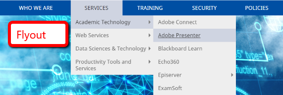
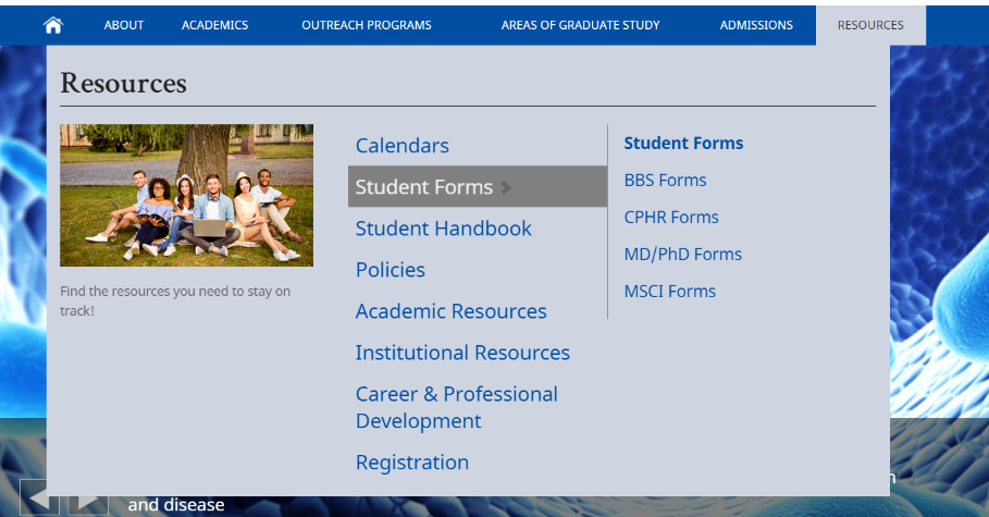
- the menu can be set to display as "flyouts" or "mega-menu"
- this setting is on the Microsite Landing page (homepage)
- if you are not an admin of your site, you can send a request to ask someone from the web team to turn the mega-menu option on
Flyout menu
Mega Menu
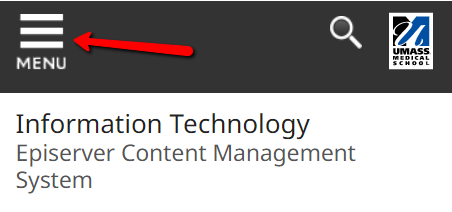
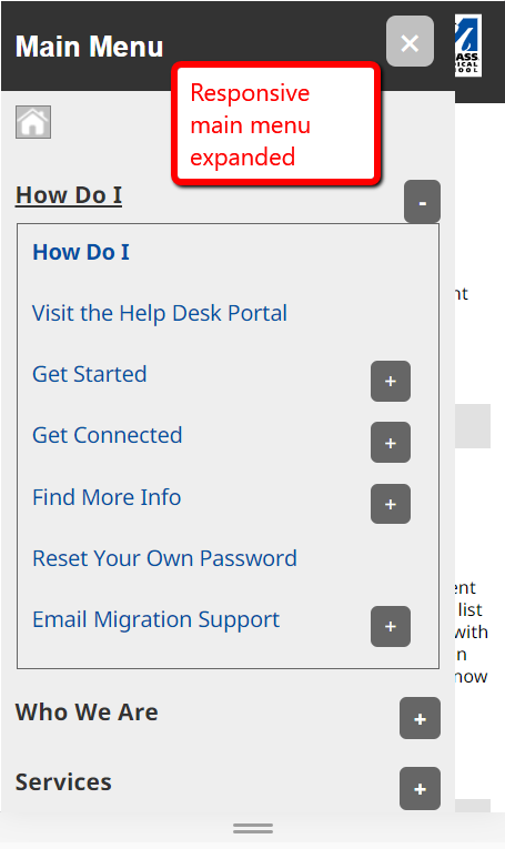
- on small devices, the menu will hide under a "hamburger" icon in the top left of the page
Responsive Main menu
Expands up click
Top Slider Area
This area can be used to display items that stretch above the main content (3 columns area). This is typically used for sliders or to display an important messages.
- This is a drop block area, any amount of blocks can be added
- Blocks will stretch the full width of the browser
- [Horizontal Full Width Block] can be dropped here to add background colors to separate blocks and set the width of the items inside of it
Left Column
This area will always show the left menu at the top of the column unless it is set to hide. There is a drop block area below the menu.
- if the left menu is set to hide and there are no blocks in this column, the entire column will hide
Main Content
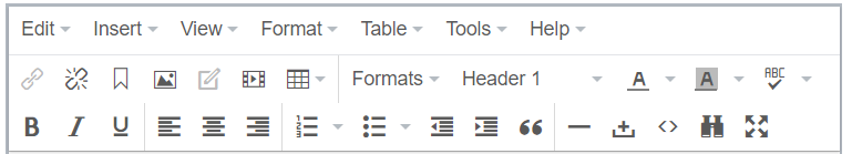
This area is a WYSIWYG (what you see is what you get) text editor. This text is free form and can be formatted as needed, similar to MicroSoft Word.
- the WYSIWYG editor allows for
- inserting images, links, tables, etc.
- some formatting set through the Formats and Paragraph dropdowns in the menu
- the may appear different in the WYSIWYG editor, it will appear appropriately on the web page
Right Column
This is a drop block area.
- if there are no blocks in this column, the entire column will hide
Horizontal Content Area (being retired, do not use)
Since we can set the "display as" on blocks to set the width and create columns, this block is no longer needed. Use the Vertical Content Area (see below).
Vertical Content Area
This is a drop block area. You do have the ability to create staggered columns in this area, the default is that the blocks will stack one on top of the other.
- Each block can be set to a particular column width
- Hover over the block to see the menu icon, click on the icon and choose "Display As" to set the width of your block:
- Full width
- Full width with padding left and right
- theme width
- 1/3 or 2/3
- 1/4 or 1/2
- 3/4
- if there are no blocks in this area, the entire area will hide
- List of blocks
Examples
Our Examples web site displays all of the CMS available page types and block types and how they can display on a page.
https://www.umassmed.edu/zzz/example-site/
You can navigate the site, using the top menu, to see how page and blocks can be displayed and notes on their property settings.


